
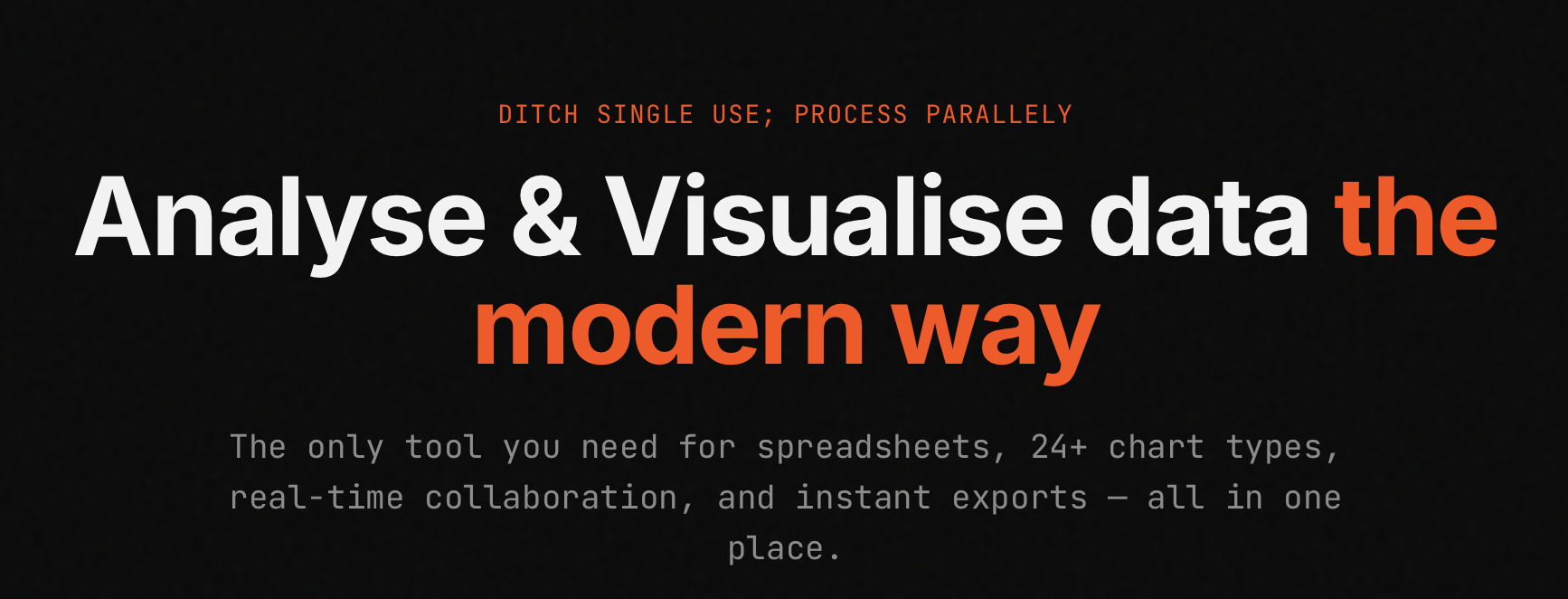
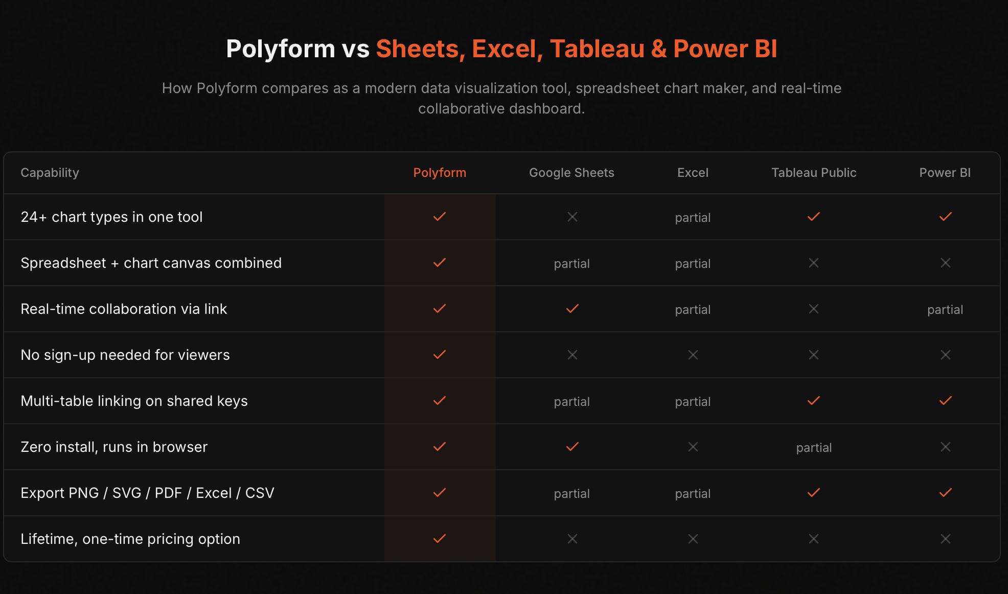
Polyform lets you edit data just like a familiar spreadsheet, while instantly visualising it across 24+ beautiful chart types at the same time — bar, line, pie, scatter, radar, heatmap, candlestick, waterfall, gauge, 3D surface, and many more.
🚫 The problem PolyForm solves
It lets you edit data just like a familiar spreadsheet, while instantly visualising it across 24+ beautiful chart types at the same time
✅ How PolyForm works
Key highlights:
Change any value and watch your charts animate instantly — no refresh, no lag.
Connect multiple data sheets (e.g., sales + regions) and create combined visuals in one chart.
Sign in and start working immediately. Everything lives in the cloud.
Generate a shareable link — teammates can view or edit without signing up.
Charts as PNG/JPG/PDF, data as CSV/Excel, or full dashboards.
Add rows/columns on the fly, custom color palettes, link locking for safety, and financial/KPI charts built-in.
Whether you’re a solo analyst spotting trends or a growing team needing fast insights, Polyform scales with you.
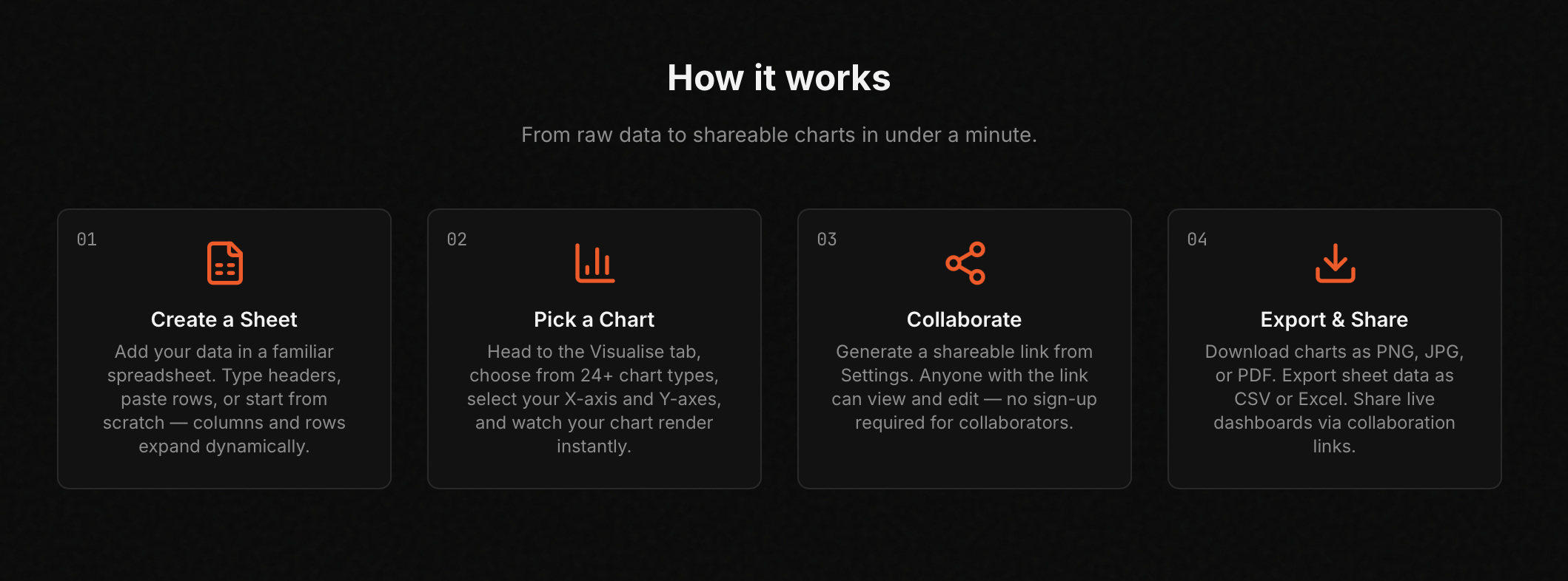
From raw data to shareable, insightful dashboards in under a minute.
No plugins. No complex setup. Just powerful, real-time data storytelling.
Key Features
- Spreadsheet
- Data visualisation
- Multi format export option for data
Founder's Story
"I Was tired of juggling between spreadsheet tools for data aggregation and visualisation tools for simultaneous chart and graph formation"
Do you use PolyForm?
Reviews
"Reviews praise PolyForm for saving time and simplifying frontend work with a broad set of high‑quality, free components. Developers highlight smooth React and Next.js use..."
Best For
- Founders
- Small to medium enterprises
- analyst
- teams